Friday, January 14, 2011

30+ “Horizontal” Navigation Menus For Blogger With CSS & HTML Codes

0 comments

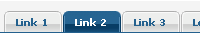
Before that I never post how to create a horizontal navigation menu tab . May exist between blogger friends who find difficulty in putting the CSS code in the template editing stages, for it to post this time I tried to give a mild solution of dish 30 horizontal menu tab instant ready-made gadgets just by adding a HTML / JavaScript and placed the code tab on the item, as well as emphasize the navigation tabs will be urgent functions on a template.

How To Add These Navigation Menus To Blogger
To add your selected navigation menu to your blogger template follow these steps,

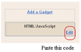
  1. Go To Blogger > Layout
  2. Click Add a Gadget or Add a Page element
  3. Choose HTML/JavaScript widget
  4. Simple Paste the Navigation Menu Code inside HTML/JavaScript widget
  5. Hit Save
  6. Drag HTML/JavaScript widget and drop it just under your Blog Header, as shown below,
    To change the links, Edit this part of the HTML in all codes below,
    <li><a href="#" ><span>Link 1</span></a></li>
    <li><a href="#" ><span>Link 2</span></a></li>
    <li><a href="#" ><span>Link 3</span></a></li>
    <li><a href="#" ><span>Link 4</span></a></li>
    <li><a href="#" ><span>Link 5</span></a></li>
    <li><a href="#" ><span>Link 6</span></a></li>
    <li><a href="#" ><span>Link 7</span></a></li>
    Replace the hash(#) sign with your Page Links /URL and replace Link1, Link2, Link3 etc with your Page Titles. If you wish to add or delete a tab then simply add or delete this line,
    <li><a href="#" ><span>Link n</span></a></li>

    Finally do not forget to save and save. See the results on his blog.

    Here's the code 30 horizontal tab navigation menu


MBT Navigation Menu #1

No Image Used
Black-Orange


MBT Navigation Menu #2

No Image Used
Purple-White-Navigation


MBT Navigation Menu #3

No Image Used
Boxed 1


MBT Navigation Menu #4

No Image Used
LIGHT-GREY


MBT Navigation Menu #5

Bulleted-top-Navigation


Tabs Menu #6

Tab Menu I


Tabs Menu #7

Tab Menu G


Tabs Menu #8

Tab Menu F
CSS CODE:


Tabs Menu #9

No Image Used
ZDnet Emulation


Tabs Menu #10

Tab Menu E


Tabs Menu #11

Tab Menu D


Tabs Menu #12

Tab Menu 12


Tabs Menu #13

Tab Menu 11


Tabs Menu #14

Tab Menu 10


Tabs Menu #15

Tab Menu 9


Tabs Menu #16

Tab Menu 6


Tabs Menu #17

Tab Menu 8


Tabs Menu #18

Tab Menu 7


Tabs Menu #19

Tab Menu K


Tabs Menu #20

Tab Menu 4


Tabs Menu #21

Tab Menu 3


Tabs Menu #22

Tab Menu 2


Tabs Menu #23

Square


Tabs Menu #24

No Image UsedHorizontal Buttons


Tabs Menu #25

Tab Menu H


Tabs Menu #26

Tab Menu 1


Tabs Menu #27

Tab Menu A


Tabs Menu #28

Tab Menu 5


Tabs Menu #29

Tab Menu B


Tabs Menu #30

Tab Menu J


NOW CLICK SAVE


add your site’s webpages to all the popular social bookmarking sites

0 comments

Instructions To Follow:

STEP #1
Log in to Blogger, go to Layout ->


page-elements

Add a Gadget of HTML/JavaScript type.


image
Then add this code in to it:.


Add Floating Hover Text - Which Trails Mouse Cursor

3 comments
If you want to show any text like "Welcome Here" or "Sign My Guestbook"or "Your Text Here", which follows the mouse cursor (trail text effect), like the one displayed in the image


STEP #1 Log in to Blogger, go to Layout


page-elements

Add a Gadget of HTML/JavaScript type. 


image
Then add this code in to it:.


<script language="javascript">


// ENTER TEXT BELOW. CAN *NOT* INCLUDE NORMAL HTML CODE.

var text='YOUR TEXT HERE...';


var delay=40; // SPEED OF TRAIL

var Xoff=0; // PIXEL COUNT FROM THE LEFT OF THE CURSOR (- VALUES GO TO LEFT)

var Yoff=-30; // PIXEL COUNT FROM THE TOP OF THE CURSOR (- VALUES GO UP)

var txtw=14; // AMOUNT OF PIXEL SPACE EACH CHARACTER OCCUPIES

var beghtml='<font color="#00436e"><b>'; // OPTIONAL HTML CODE THAT EFFECTS WHOLE TEXT STRING SUCH AS FONT COLOR, SIZE, ETC.

var endhtml='</b></font>'; // END HTML CODE. MOSTLY USED IF ABOVE SETTING IS USED.


//********** NO NEED TO EDIT BELOW HERE **********\\


ns4 = (navigator.appName.indexOf("Netscape")>=0 && document.layers)? true : false;

ie4 = (document.all && !document.getElementById)? true : false;

ie5 = (document.all && document.getElementById)? true : false;

ns6 = (document.getElementById && navigator.appName.indexOf("Netscape")>=0 )? true: false;

var txtA=new Array();

text=text.split('');

var x1=0;

var y1=-1000;

var t='';


for(i=1;i<=text.length;i++){

t+=(ns4)? '<layer name="txt'+i+'" top="-100" left="0" width="'+txtw+'" height="1">' : '<div id="txt'+i+'" style="position:absolute; top:-100px; left:0px; height:1px; width:'+txtw+'; visibility:visible;">';

t+=beghtml+text[i-1]+endhtml;

t+=(ns4)? '</layer>' : '</div>';

}

document.write(t);


function moveid(id,x,y){

if(ns4)id.moveTo(x,y);

else{

id.style.left=x+'px';

id.style.top=y+'px';

}}


function animate(evt){

x1=Xoff+((ie4||ie5)?event.clientX+document.body.scrollLeft:evt.pageX);

y1=Yoff+((ie4||ie5)?event.clientY+document.body.scrollTop:evt.pageY);

}


function getidleft(id){

if(ns4)return id.left;

else return parseInt(id.style.left);

}


function getidtop(id){

if(ns4)return id.top;

else return parseInt(id.style.top);

}


function getwindowwidth(){

if(ie4||ie5)return document.body.clientWidth+document.body.scrollLeft;

else return window.innerWidth+pageXOffset;

}


function movetxts(){

for(i=text.length;i>1;i=i-1){

if(getidleft(txtA[i-1])+txtw*2>=getwindowwidth()){

moveid(txtA[i-1],0,-1000);

moveid(txtA[i],0,-1000);

}else moveid(txtA[i], getidleft(txtA[i-1])+txtw, getidtop(txtA[i-1]));

}

moveid(txtA[1],x1,y1);

}


window.onload=function(){

for(i=1;i<=text.length;i++)txtA[i]=(ns4)?document.layers['txt'+i]:(ie4)?document.all['txt'+i]:document.getElementById('txt'+i);

if(ns4)document.captureEvents(Event.MOUSEMOVE);

document.onmousemove=animate;

setInterval('movetxts()',delay);

}

</script>


Now click Save

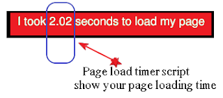
Page load timer script: show your page loading time

0 comments


Steps to follow:

STEP #1
Log in to Blogger -> Layout -> Edit HTML and select the tick-box Expand Widget Templates
Then, find (CTRL+F) this code in the template
<head>

And immediately after it, paste this code:


<!-- page load timer -->
<script type='text/javascript'>
var d = new Date();
var starttime = d.getTime(); //Get the start time
</script>


STEP #2
Now find (CTRL+F) this code in the template:
</body>
And immediately before it, paste this code:


<!-- page load timer start -->
<script type='text/javascript'>
var d2 = new Date();
var endtime = d2.getTime(); //Get the end time
//Find the difference between the start and end times
var totaltime = (endtime - starttime)/1000;
//Round 2 decimal places
var result = Math.round(totaltime*100)/100;
//Output results to a &quot;P&quot; element
document.getElementById(&quot;loadtime&quot;).innerHTML = &quot;Page loaded in: &quot;+ result +&quot; seconds&quot;;
</script>
<!-- page load timer end -->


Now click Save Template 


STEP #1 Log in to Blogger, go to Layout

page-elements
Add a Gadget of HTML/JavaScript type. 


Then add this code in to it:


<!-- Widget portion -->


<p id="loadtime">Write your custom message here</p>

How to Make your Blogger Blog ready for Mobile Phones

0 comments
making your blogger blog mobile friendlyAs you know, millions of people use their mobile phones to access internet. The mobile internet speed is also very fast these days with 3G's , mobile apps,etc.

From this, we can say many of your readers are coming to your blog through mobile phones..But, if you don't make your blog mobile friendly, .you may lose all your mobile readers because in a mobile phone, a normal blog takes lot of time to load and there are other issues that your site not fitting properly in the mobile screen.

So, here is how to make your Blogger (blogspot) blog mobile internet friendly..


1. Sign into your Blogger account > Design > Edit html
2. Search (Ctrl+f) for the following line (it will be on top side)

<b:include data='blog' name='all-head-content'/>

3 .Now after this line add the following code -

<meta content='IE=EmulateIE7' http-equiv='X-UA-Compatible'/>

<b:if cond='data:blog.isMobile'>

<meta content='width=device-width, initial-scale=1.0, user-scalable=0' name='viewport'/>

<b:else/>

<meta content='width=1100' name='viewport'/>

</b:if>


Now click Save Template 


4. That’s all, now your blog is mobile compatible and will load faster for mobile users.

Followers

Blogumulus by Roy Tanck and Amanda Fazani
Free Blogger Tips, Hacks, Widgets, Templates and more